Instructions

GSAP - Brush

How to Edit GSAP Animations - Brush

The brush animation used in page headings is powered by GSAP. Use the guide below to understand how it works and how to customize or remove it.

⚠️ GSAP animations do not run in preview mode. Publish the page to see the animation in action.

Classes
  • Stroke: The SVG path that draws the brush animation.
  • Brush: The wrapper element for the stroke.
    The default width of this element is 435px.
    Add a custom class to this element if you need to adjust the width or position to fit different word lengths.
Attributes
  • On the Brush element: data-animate="svg"
    This attribute triggers the SVG path animation.

Customizing Key Variables - Brush

  • delay: X
    Controls how long the animation waits after it is triggered.
    0.2s is recommended for pages with preloaders such as the homepage.
  • duration: X
    Controls how long the brush path animation takes to complete.
    Increase the value to slow down the animation.
    1.5s is recommended for best results.

Removing the GSAP Animation - Brush

  1. Remove the GSAP code snippet from the Page settings ➡️ Custom code ➡️ Before </body> tag.
  2. Delete the Brush element from the heading.
  3. Save and republish the page.
GSAP - Typewriter

How to Edit GSAP Animations - Typewriter

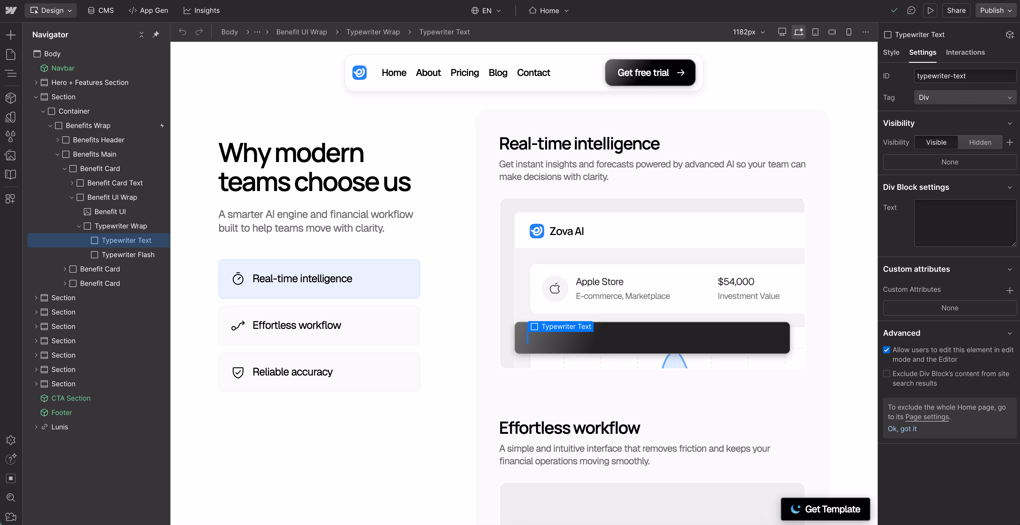
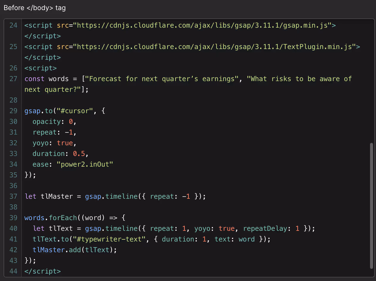
The typewriter animation used in the homepage is powered by GSAP. Use the guide below to understand how it works and how to customize or remove it.

⚠️ GSAP animations do not run in preview mode. Publish the page to see the animation in action.

Classes
  • Typewriter Text: This is where the typewriter text is inserted. The Div ID 'typewriter-text' connects it to the GSAP code.

Customizing Key Variables - Typewriter

  • words: Enter the text you want to display in the typewriter element. Separate each word or phrase with a comma.

Removing the GSAP Animation - Typewriter

  1. Remove the GSAP code snippet from the Page settings ➡️ Custom code ➡️ Before </body> tag.
  2. Delete the Typewriter Wrap element.
  3. Save and republish the page.
SVG Icons

Editing SVG Icons

Our template includes prebuilt SVG icons in three sizes: Regular, M, and L. If you want to adjust their size, follow these steps:

Resizing an Existing SVG Icon
  1. Open the Components panel and drag the icon you want to use onto the canvas.
  2. Right-click the icon and select "Unlink Instance" to detach it from the component.
  3. In the right panel, navigate to the Size section.
  4. Adjust the Width and Height as needed.

💡 Keep in mind: Any changes you make will be applied globally to all icons using the same class (i.e., the "Icon" class)

Changing the Icon Color

If you want to change the icon color, head to the Typography section in the Style panel and adjust the font color.

💡 Keep in mind: Any changes you make will be applied globally to all icons using the same class (i.e., the "Icon" class)

Adding Editable SVG Icons

If you want to add new SVG icons that can be styled directly within Webflow, you can use Phosphor Icons, a flexible and customizable icon library.

How to Import a New SVG Icon
  1. Visit Phosphor Icons and browse their library.
  2. Find the icon you want and click "Copy SVG" to copy the SVG code to your clipboard.
  3. In Webflow, insert a Code Embed element onto your page.
  4. Paste the SVG code you copied.
Making the SVG Icon Editable in Webflow
  1. Locate the "fill" attribute in the SVG code.
  2. Replace its value with currentColor (without quotation marks).
    • This allows the icon to inherit text color from Webflow’s Style panel.

Now, you can easily adjust the color and size of the icon directly within Webflow.

💡 Pro Tip: Our templates come with a predefined “Icon” class, so you can simply apply this class to your new icon to maintain a consistent style across your site.

Get Template